
Breif:
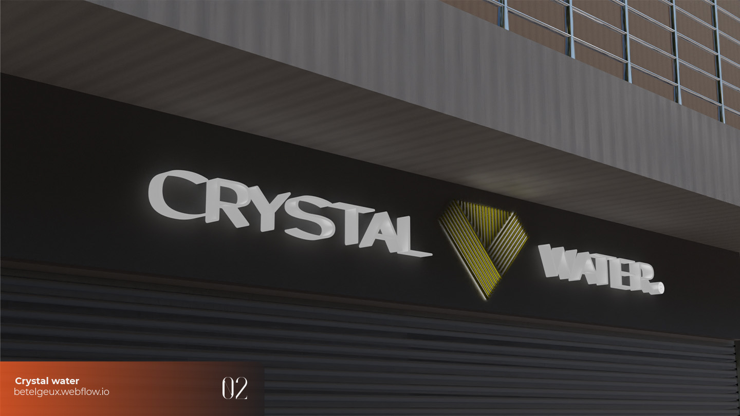
CRYSTAL WATER
Crystal Oud
The chain of command became perplexing after the merger, and it took some time for us to get accustomed to it before we were able to communicate. And I was glad to see that they had taken into account my suggestions from the previous time regarding how crucial it is to keep the name and logo simple and close to the primary image. Because it had been a while since we had collaborated, we quickly went through the paperwork and I started listening to my client's concerns and offering him suggestions, until we had a clear image in mind. Then I started working.
The scent of heavens
I went back to the company's original logo (funny enough, it was the first logo I ever created for pay, and I did it in Photoshop; it's nice to see my older work and how far I've come along), which my client still found appealing, and more importantly, that many customers were accustomed to. The result needed to look simple, but sometimes the best work is when you don’t notice change. I had a couple of steps in this project:
- re-design the logo
- create the key visuals
- create guidelines (logobook).
Simple is never easy. If you don't notice anything, the work was done well and it functions flawlessly. I went back to this logo in image 1. and began to sketch as you can see in image 2. until I created a couple of sketches I liked. After creating a demo vector-version, I sent images 3,4,5 to my client. And he chose the option 4 as you see here image 6. The end result is a logo that is unique, but still has the original image and relation. It is really complicated work here. Of course it’s not that wise to share the full structure and logo scheme, but I will show some snippets on behance later. Follow here.Later I created the key visual and guidelines (for the logo to do good, it’s crucial to apply and follow the guidelines)
Follow-up

go up

brief
"CM perfume" follow-up I'll continue by describing how I helped the business maintain a premium image that matched the level of quality of their high-end services and goods. It's significant from a marketing perspective, as well. Their product line includes floral, woody, spicy, and fruity scents, catering to a wide range of customers with diverse preferences. Their perfumes are made from high-quality ingredients sourced from all over the world, and their unique blends are carefully crafted by skilled perfumers.
#
Brand ID
CRYSTAL WATER
Challenge

Crystal Oud
The chain of command became perplexing after the merger, and it took some time for us to get accustomed to it before we were able to communicate. And I was glad to see that they had taken into account my suggestions from the previous time regarding how crucial it is to keep the name and logo simple and close to the primary image. Because it had been a while since we had collaborated, we quickly went through the paperwork and I started listening to my client's concerns and offering him suggestions, until we had a clear image in mind. Then I started working.
Approach
The scent of heavens
I went back to the company's original logo (funny enough, it was the first logo I ever created for pay, and I did it in Photoshop; it's nice to see my older work and how far I've come along), which my client still found appealing, and more importantly, that many customers were accustomed to. The result needed to look simple, but sometimes the best work is when you don’t notice change. I had a couple of steps in this project:
- re-design the logo
- create the key visuals
- create guidelines (logobook).
Simple is never easy. If you don't notice anything, the work was done well and it functions flawlessly. I went back to this logo in image 1. and began to sketch as you can see in image 2. until I created a couple of sketches I liked. After creating a demo vector-version, I sent images 3,4,5 to my client. And he chose the option 4 as you see here image 6. The end result is a logo that is unique, but still has the original image and relation. It is really complicated work here. Of course it’s not that wise to share the full structure and logo scheme, but I will show some snippets on behance later. Follow here.Later I created the key visual and guidelines (for the logo to do good, it’s crucial to apply and follow the guidelines)


Output


Follow-up
Other projects:
I am a creative designer specialized in web, graphic design, and branding, packaging, video editing, and photography. Let's talk about your project and how I can help your business thrive.
